

There are a lot of similarities between a trade show exhibit and outdoor advertising. You are located on a pathway and people are racing by. They glance to the left and to the right. They have a lot of other things to look at. You only have a few moments to attract their attention. 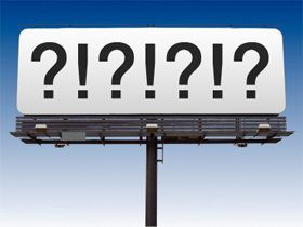 The challenge is very similar to designing a billboard to be placed on a busy Interstate highway.
The best billboards evoke an emotional connection.
They are usually entertaining and often use humor. To be effective billboards must be short, sweet, simple and to the point. Not surprisingly, many of the “rules” for great outdoor advertising design translate to the trade show floor.
- Be relevant or your exhibit will be invisible. Make sure your ads appeal to your target market. Use colors, images and words that will attract them and draw prospects into your exhibit.
- Bright and bold colors are more effective. Bright colors work well, but limit your pallet to two or three at most. Exhibits with multiple bright colors are visually confusing and that reduces the overall effectiveness. Even if you are marketing natural and “green” products, consider using clean blue or bright white rather than the more expected green-brown palette. Green and brown are very likely to recede into the background and have little visual impact unless you compensate for the color palette with other design elements.
- Visibility matters. Make your major exhibit graphics large enough to be seen quickly and from a far distance.
- Use words sparingly and make them easy to read. Use large, legible type. The best bet is solid backgrounds with sharply contrasting type. And unless there is a compelling reason for vertical type, orient your type horizontally – it is easier to read.
- Choose graphics that connect with your target. Select images that will generate the strongest emotion related to your product or service.
Leave A Comment